I am passionate about creating innovative and engaging digital and non-digital experiences for all users by combining my flair of good design mixed with UCD principles. As former Head of Web Accessibility I am experienced at guiding product designers and teams to design and think inclusive design. I am used to working on agile projects to tight deadlines within a fast-paced environment. I have a strong desire to learn new creative technologies and processes to help develop teams.
Outside of work I am an artist who paints, sketches and have had a couple of solo and mixed exhibitions. I spend some of my time learning new designs or making things such as jewellery and spending time walking with Winston, my 9 year old dog.
Contact me if you'd like to talk about any upcoming projects you're working on Email me or connect with me via linkedin.
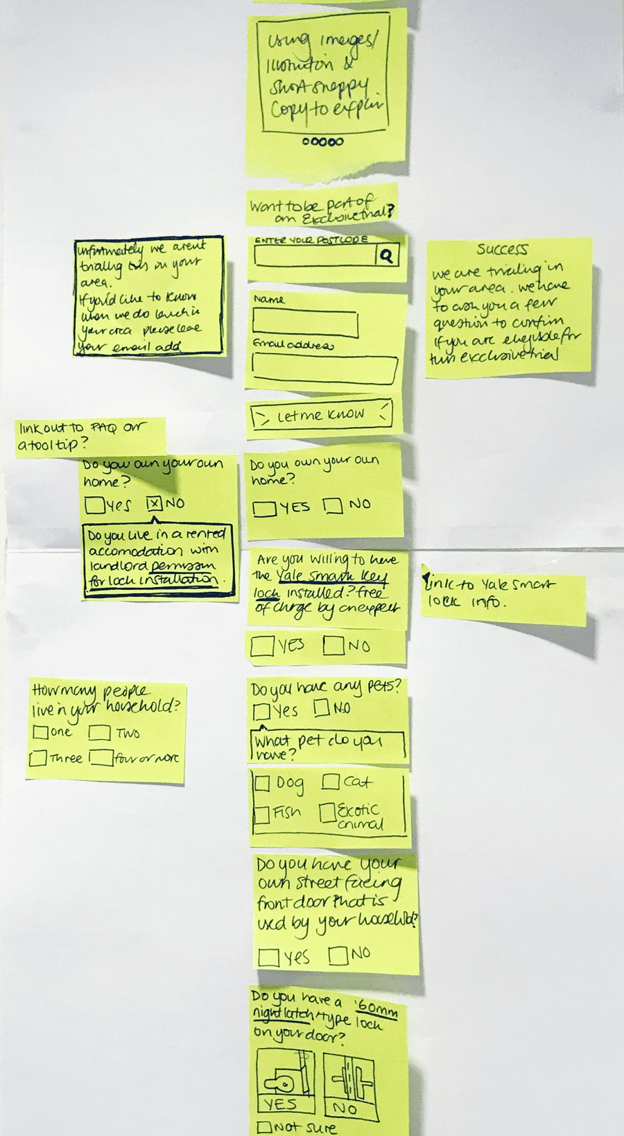
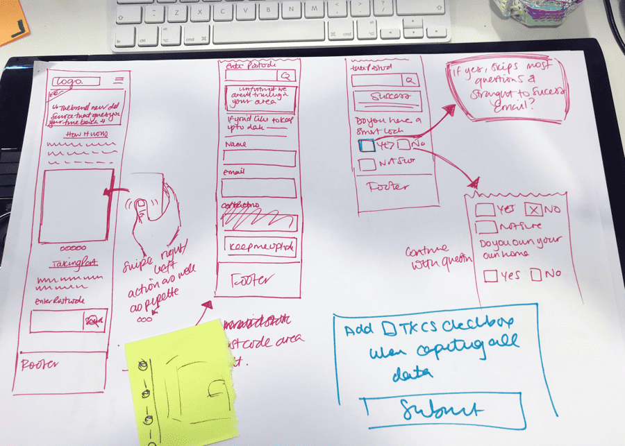
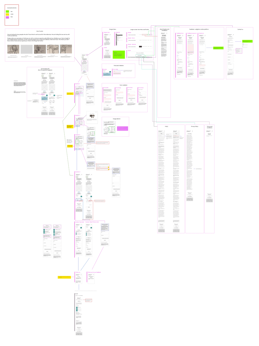
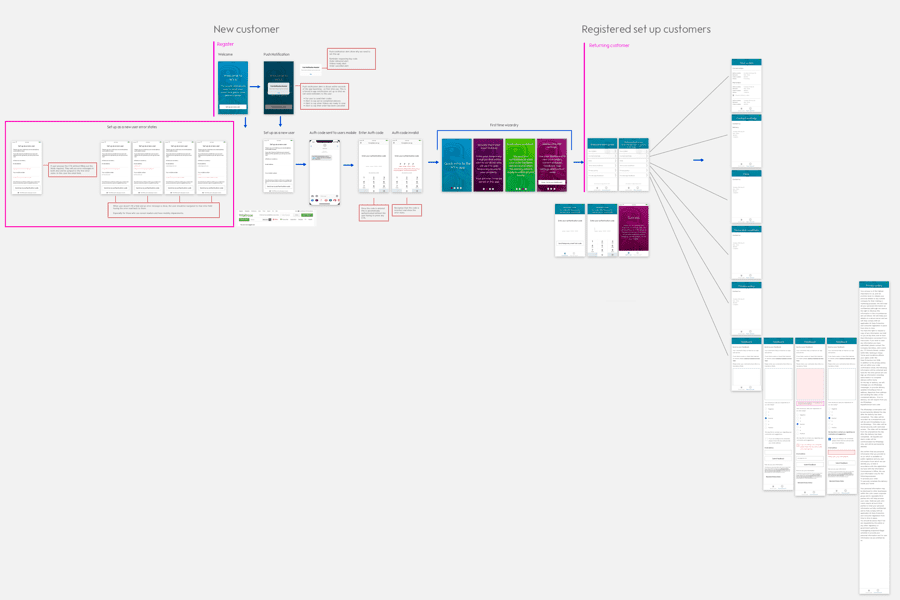
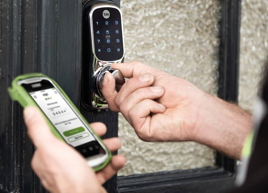
The Service blue print for While you're away by Waitrose was done before I joined the team to work on the customer journey. With a short time, frame and no realisation of what the product needed I walked through the blue print with the entire team and highlighted what had been done, what had changed since the service design and what we needed to get in front of the customer. I had identified we required a website that would have qualifying questions and information about the service. Secondly, we needed a driver app that would show the information of the delivery and the one time smart lock code. Thirdly we needed a highly secure customer app.
Working with dates and timelines I wanted to flush out what we could do and what was a nice to have. Working with the developer and product owner I got this out on post it notes so that we were all clear of our expectations without any surprises.
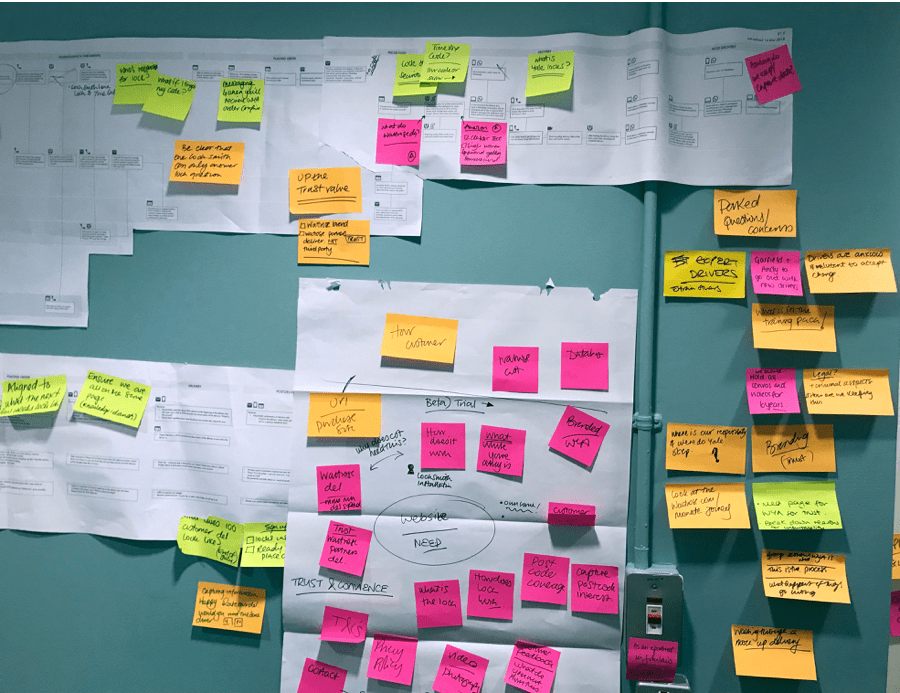
The developer got working on the foundations of the website and got working on the driver app while I worked on the customer journey for the Website and customer app.
I put together this prototype and worked with the product owner, researcher and the operation team to move the post-it notes around in order of importance.
I put together a visualised story of how While you're away journey. We needed imagery and this was the foundation of the idea of imagery we were looking for. Working closely with the UI Designer I was able to work in this way with sketches to translate ideas across to the designer.
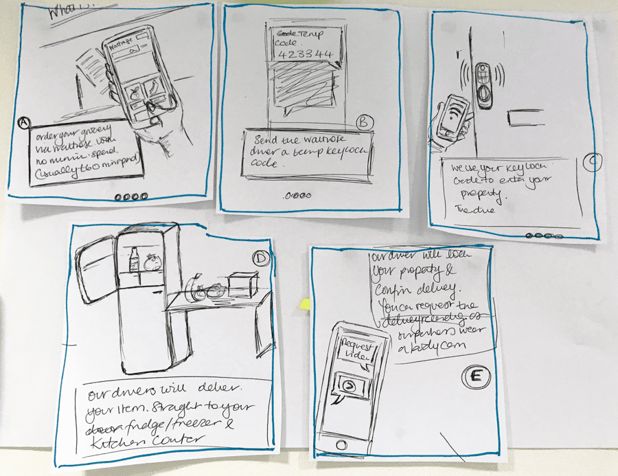
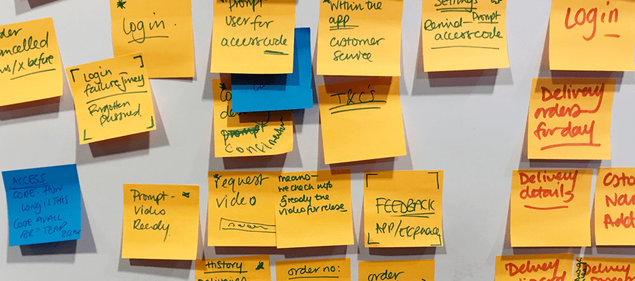
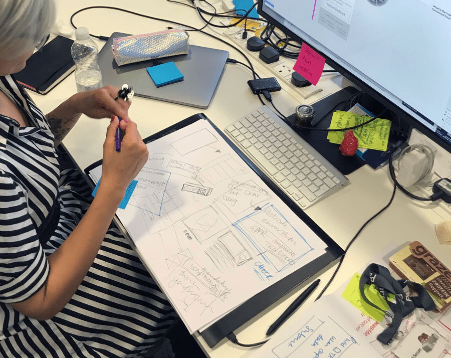
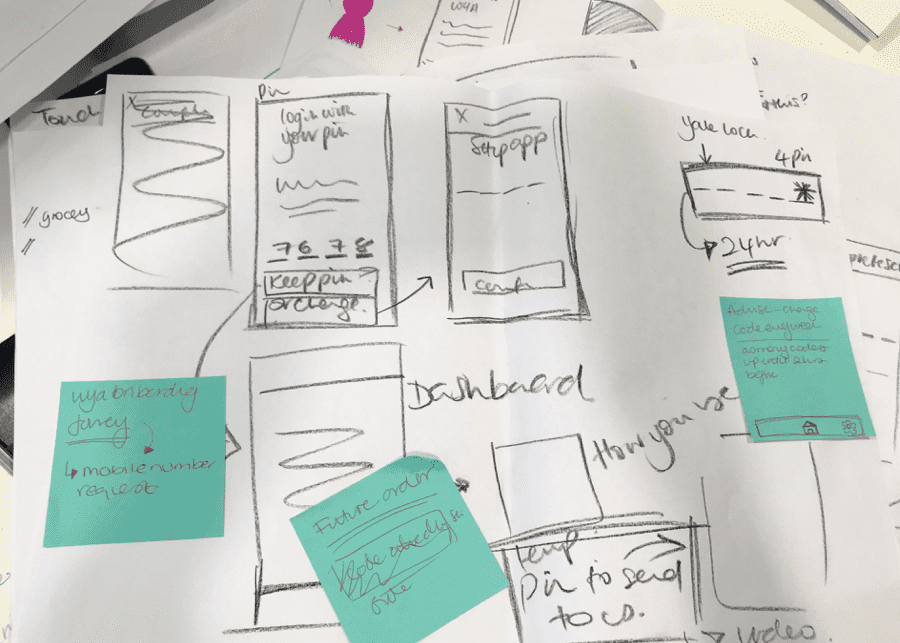
This is me working very hard to get the Customer onboarding user flow together for the designer to work on.
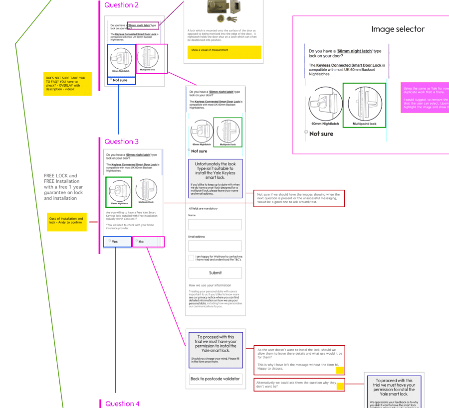
Working in this way brought up many questions around the technicalities of for example logging in with a pin code secure to the user, however we had a pin log in upfront this would be a very confusing journey. I was able to provide a MVP solution.
 Back to main page
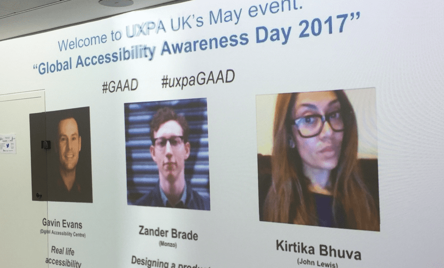
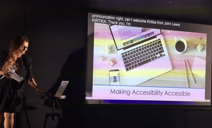
A talk given by Kirtika Bhuva at UXPA UK's May 2017 event covering "Global Accessibility Awareness Day"
My very first talk with sold out tickets. Better not mess it up.
There's always a naughty joke thrown in.
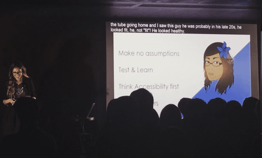
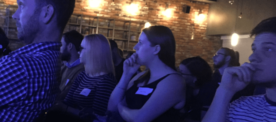
The audience looked engaged. Winning.
 Back to main page
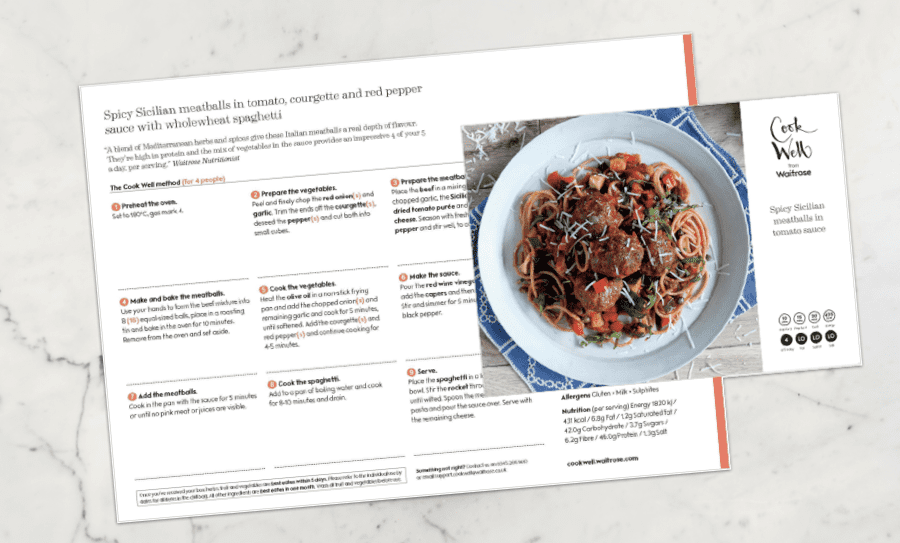
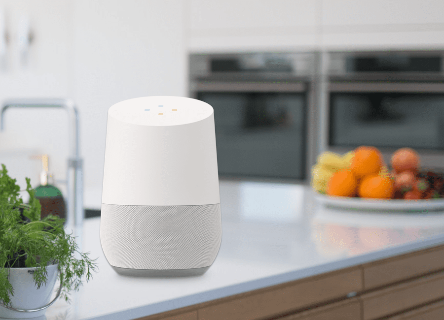
Recipe card written with 9 steps to follow. Average time spent on recipe would be 30-40 minutes this includes re-reading the recipe card.
Working with Google, the tech guys used APIs to structure the recipes. I helped re-write most of the steps so that it was more of a conversational tone. I tried to keep it down to 13 steps for the research.
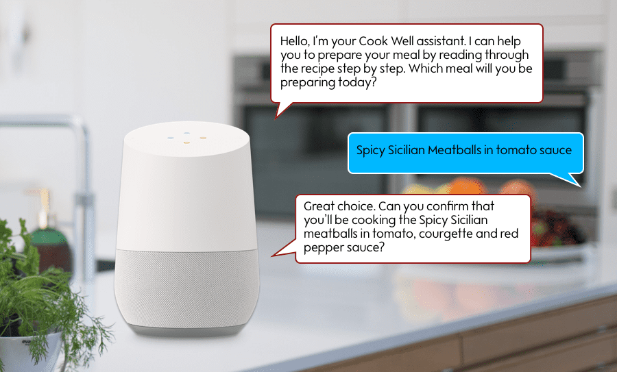
Working with Google, the tech guys used APIs to structure the recipes. I helped re-write most of the steps so that it was more of a conversational tone. I tried to keep it down to 13 steps for the research.
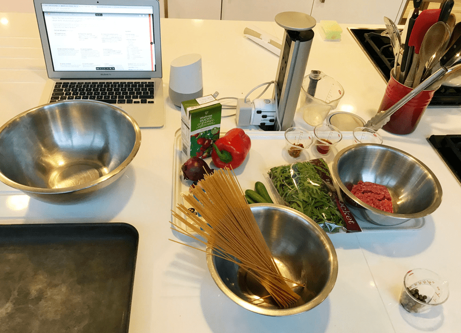
The key here was to prep. I booked in a day with the Waitrose Cookery school and had four participants with various cooking skills and abilities to participate in the research. This research had to be as true to what the user would get at home as possible and so had ensured there were four Cook Well boxes containing the Sicilian meatball recipe delivered to the cooking school. As with any amount of prep you do there are always going to be hick ups, the boxes didn't turn up so I had to buy the ingredients and measure them out before the participants had arrived.
In case any participants couldn't make it on the day I had a list of people who were ready to step in and help with the research. I had a couple of observers and note takers so that we could all share our findings as there would be a lot going on during the research.
There was a lot of interesting information observed on the day. Particpants had a lot to say, many hadn't used Google home but said they would use this as they either didn't have any space or felt that this was a cooking companion and felt more confident in cooking. In all I noticed that the speed of cooking was down to 25-30 minutes because users could ask for a step to be repeated if they were unsure of what to do and not have to read a card.
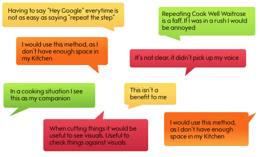
Voice allows users to easily multitask and enabled them to do things faster than other device saving time to go and do other things. It also empowered them to instantly get answers and information, making their daily routine easier.
With this being the first round of testing the next steps were to revise the steps, see how we could apply this technology to the other recipes without having to manually re-write all the recipes for voice and to test this in customers kitchens.
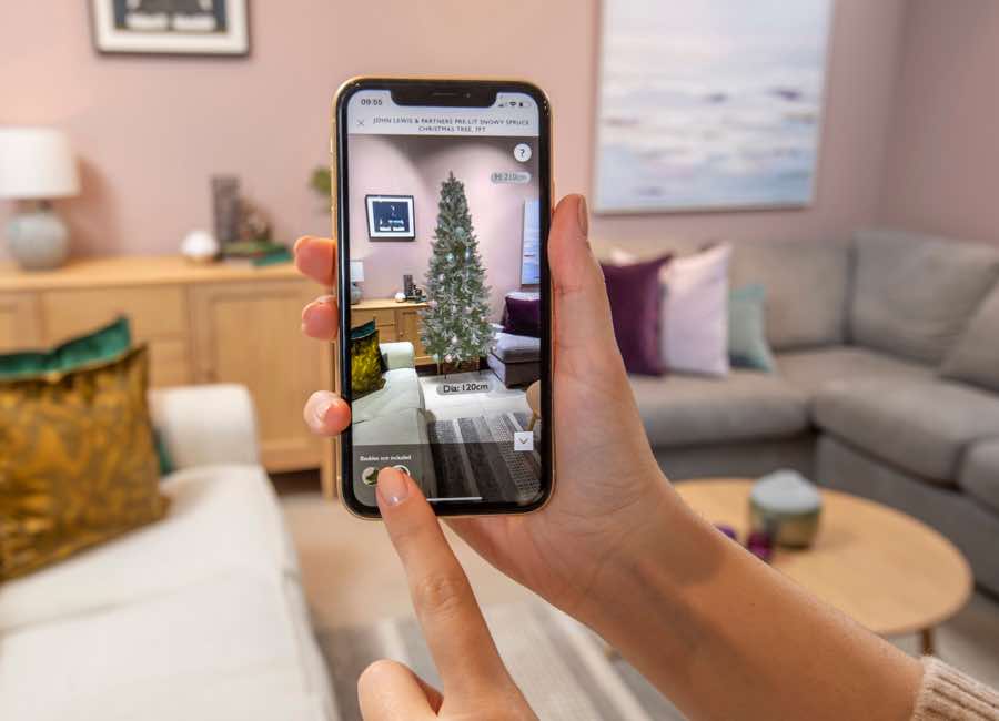
Back to main pageIn early October when we were in Tier 3 heading into what could be another lockdown, we wanted to create an experience for users at home as if they were going into the John Lewis shops. Keeping customers safe and being able to give them confidence in shopping online for their special Christmas tree.
This was a project with tight deadlines. We had two weeks to obtain the images and get the experience and design in place for launch. Using the existing code for the Sofa AR experience we pulled this together and amended/added to the design.
Having used the suppliers photo, we weren't seeing the kind of quality images we were looking for and they weren't as Christmassy as we’d hoped. My hypothesis was that users would want to see the size of the tree in their own home but wouldn't pay much attention to the quality of the AR image of the tree. To have this hypothesis varied, I worked with a researcher to pull together users for testing and have them list in priority what they look for when shopping for a tree.
Size came out on top so this gave us confidence to launch what we had. John Lewis sold a lot of trees via the app in the next few weeks. These included the ones where users could see an AR tree in their home.
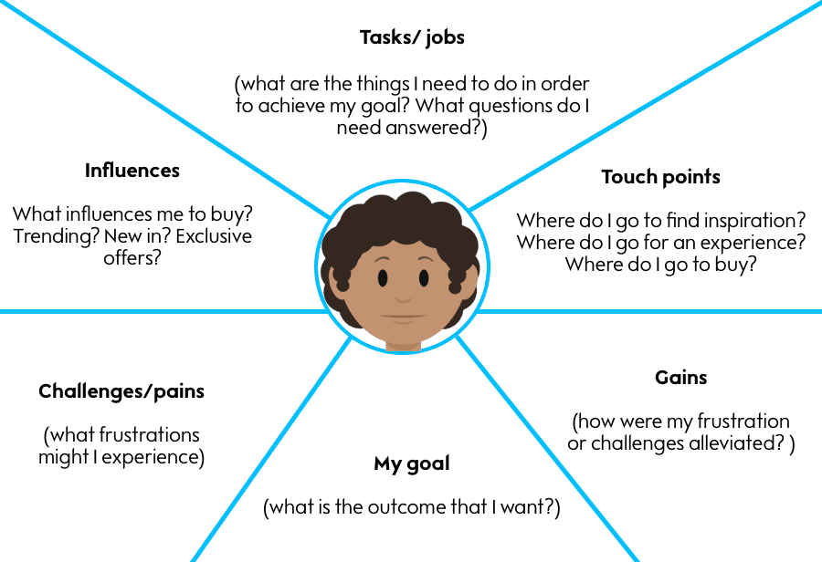
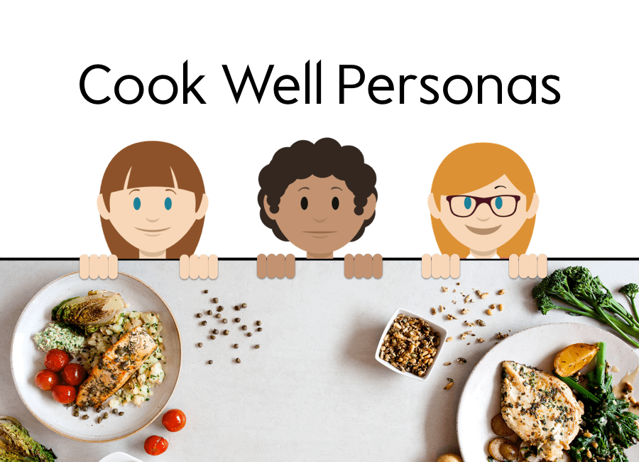
Back to main pageCook Well had many ideas and were executing those ideas but didn't truly know who their audience were. The goal of this task wasn’t to represent ALL audiences for the product, but to paint a picture with a broad brush and meet the needs of a larger population.
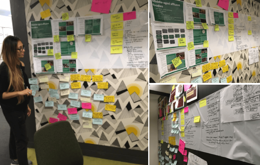
Being new on the project I wanted to pull our who really were our customers. Using the research, the team had including the Waitrose pen portraits that were done for groceries I pulled together a two day workshop and worked with Nick (researcher) and Ian (Ux copywriter) to pull out who are our customers and a tone of voice for Cook Well.
In a nutshell I pulled out the three main persona types, Time short Bhavin, Maria the Organised homie and The Good life Margaret. Pulling out the main points from each person to bring to life what our customers are saying and how we can help this to influence the way we think, research and move forward with ideas.
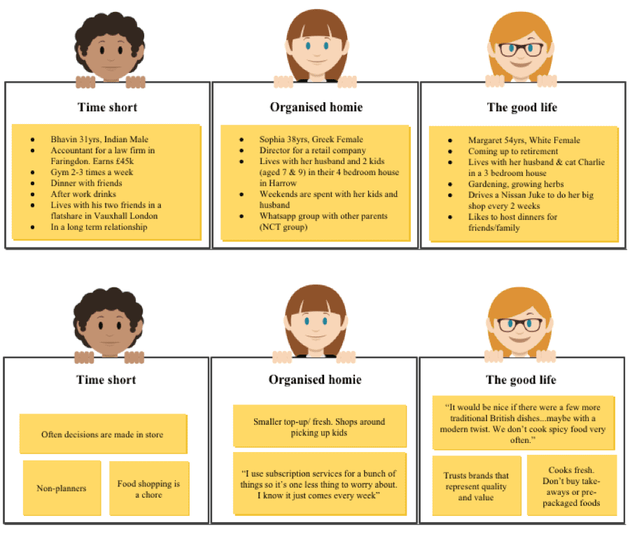
Personas help to focus decisions around site components by adding a layer of real-world considerations to the conversation. For example, the persona Time short Bhavin, we set the background along with the task
It’s Monday morning, the week has arrived. Bhavin is totally focused on the busy week he has ahead. He hit the snooze button and skipped breakfast this morning, like most Mondays. Now, at 11am, his tummy is rumbling and his thoughts turn toward food. He’s annoyed that he hasn’t planned dinner again for tonight, and that there’s nothing in the fridge (that’s edible anymore).
Bhavin remembers the food he had Sunday night with his partner and his friend who cooked the delicious meal. Bhavin remembers how impressed everyone was with the food and remembers feeling slightly envious.
Bhavin is hosting a dinner for 3 of his close friends and wants to impress them with something…. He doesn’t have the time to go shopping and lacks the inspiration of coming up with something new. He needs something by Saturday afternoon so that he can clean the house, prep and cook the food before his guests arrive.
Provided examples of how we can use the personas with empathy maps, customer journey maps and test cards when it came to stepping out of work mode and into the way a customer would think and behave. The idea of this was to remind the team that our personas are only as good as the research behind them. To continue doing the research and our personas will evolve over time.
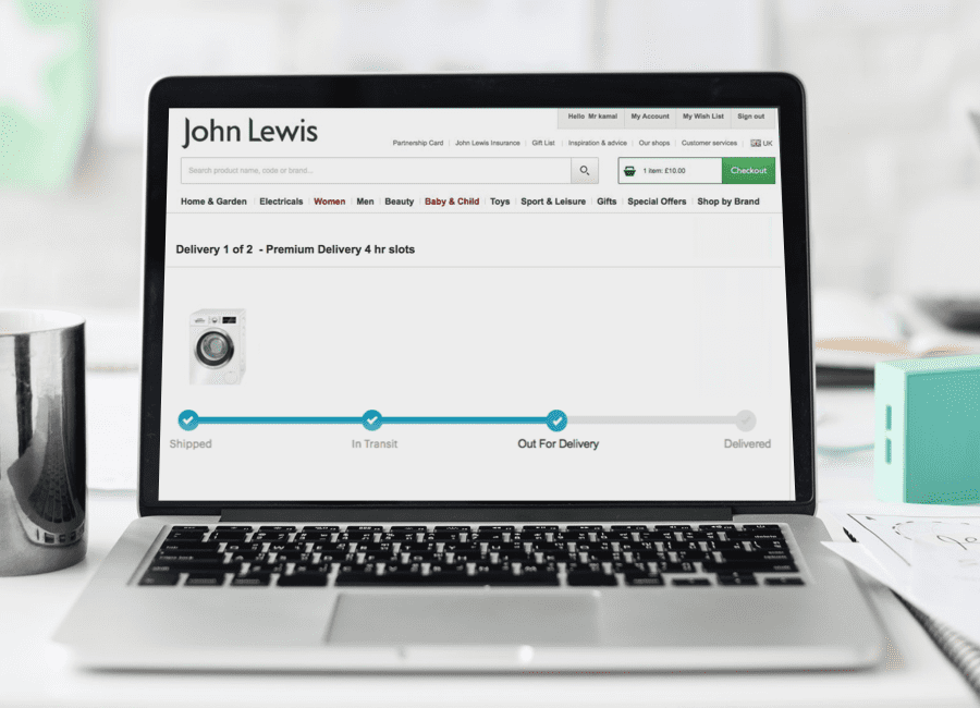
Back to main pageThe Event Hub, one of the key customer fulfilment projects, provides an ‘air-traffic control’ capability to support the end-to-end visibility of customer deliveries as they move through the different stages of order fulfilment. This will provide customers with the ability to view the statuses of their deliveries online and should reduce, and in some cases, eliminate the need for customers to contact John Lewis. This new capability will also provide partners and Contact Centre agents with relevant information in a single view, to allow a faster and more effective resolution of delivery queries and escalations.
“I want to have access to clear and concise information around the John Lewis delivery and service. I want to be notified through the different stages.”
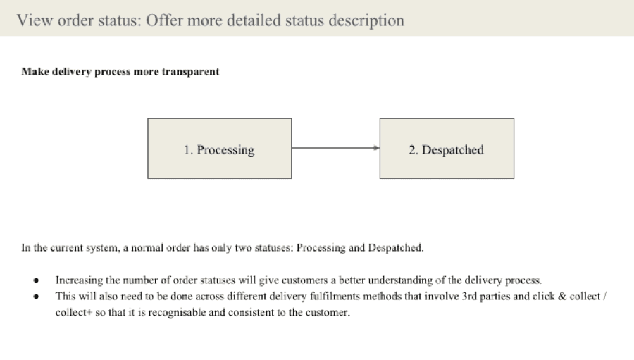
To make the delivery process more transparent and to reduce contact to order ratio by informing customers of their order statuses in real time.
The issue is that customers are currently unable to find clear information about the status of their order online without Call Centre contact. With a business benefit of reducing contact to Call Centre, increasing customer satisfaction.
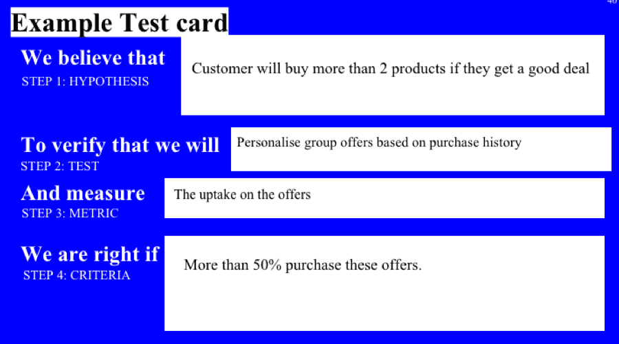
Working with the business stake holder running the project I wanted to flush out the main goals from a customer and business view with assumptions we could test. This helps to identify if there is a problem, where the problem and how to focus on working on a better journey for the customer and business.
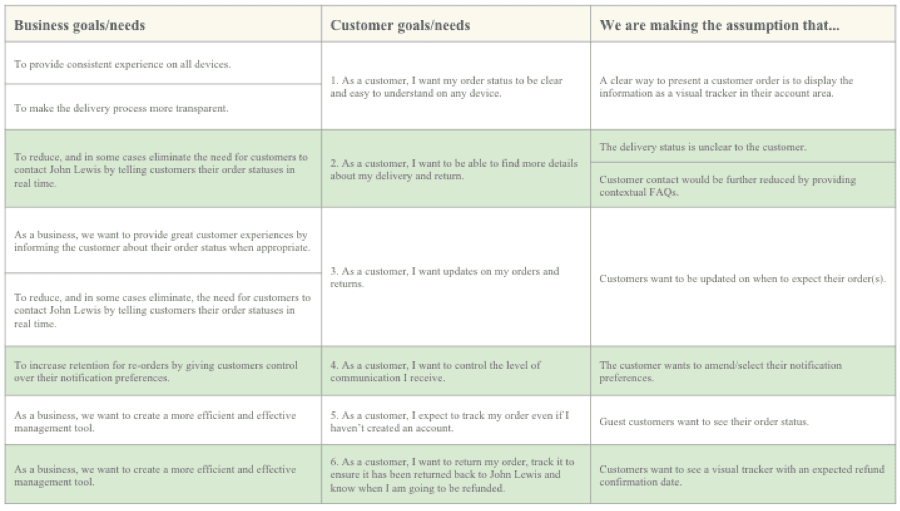
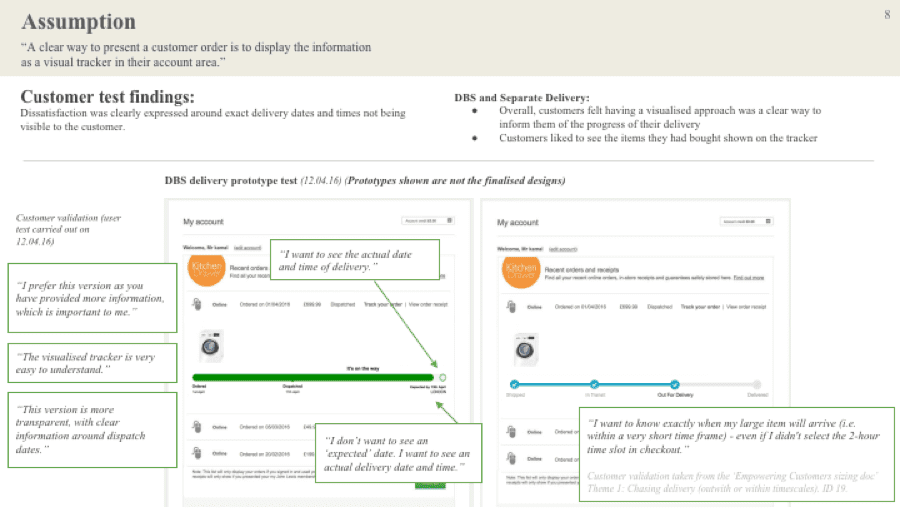
Assumption: “A clear way to present a customer order is to display the information as a visual tracker in their account area.”
Similar to what a few other retailers were doing, I mocked up a quick prototype showing users a visualised tracker with order date, dispatch information and expected order delivery date.
“I don’t want to see an ‘expected’ date. I want to see an actual delivery date and time.” “I want to know exactly when my large item will arrive (i.e. within a very short time frame) - even if I didn't select the 2-hour time slot in checkout.”
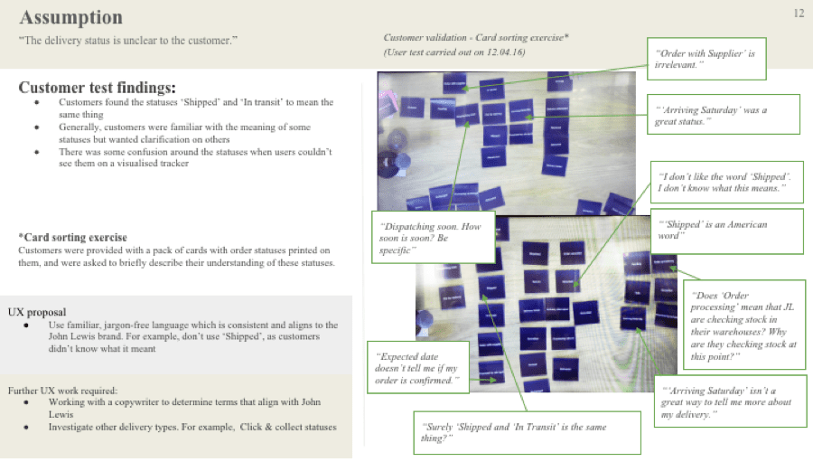
Assumption: “The delivery status is unclear to the customer.”
Working with a researcher we invited a few participants into the UX lab to carry out customer testing. Customers were provided with a pack of cards with order statuses printed on them, and were asked to briefly describe their understanding of these statuses.
Generally, customers were familiar with the meaning of some statuses but wanted clarification on others. There was some confusion around the statuses when users couldn’t see them on a visualised tracker
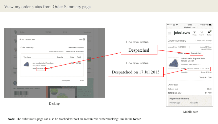
Order statuses seen on apps show a green, orange or red circle along with the order statuse.
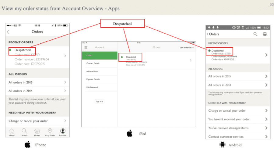
Order statuses seen on web view aren't as clear as on app, they are hidden amongst the product item. Often without a despatch date.
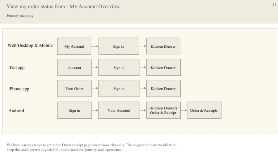
John Lewis have various ways to get to the Order receipt page via various channels. The suggestion here would be to keep the touch points aligned for a more seamless journey and experience.
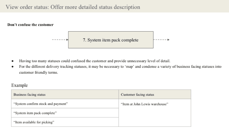
Explore how the visualised tracker will work with other delivery types, i.e. Click & collect. Investigate showing an expected delivery date for one man deliveries, when we cannot provide an exact delivery date. To explore if additional information is required for other delivery types such as delivery drivers contact information. Working with a copywriter to determine (statuses) terms that align with John Lewis
This was an in-depth UX shaping document pulled together to show various stakeholders from different parts of the business who were working in silo on delivery, delivery information, delivery communications and implementation of new services that by pulling out the customer and business constraints we weren't fixing a problem but making it bigger.
 Back to main page
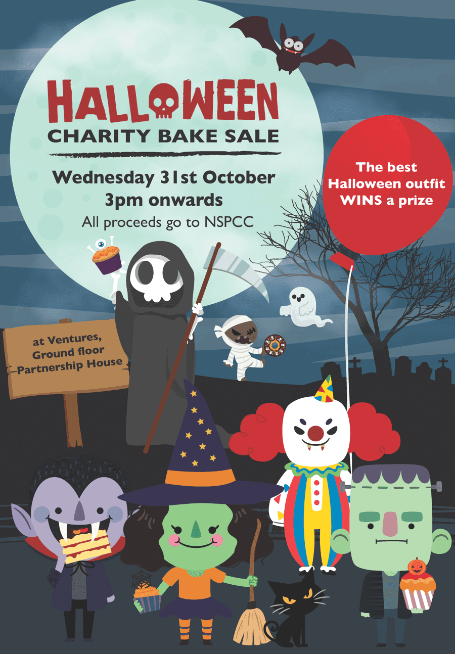
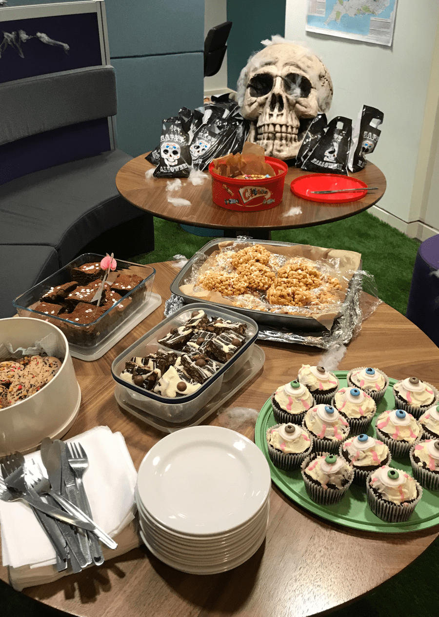
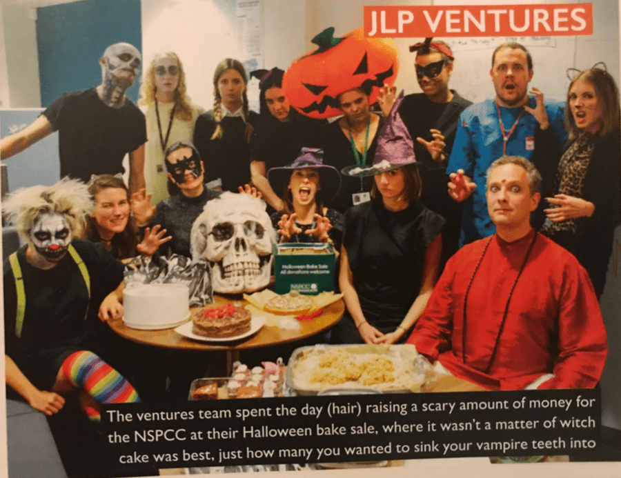
I had organised a charity Halloween bake sale at Ventures John Lewis. We collectively raised over £100 for the NSPCC.
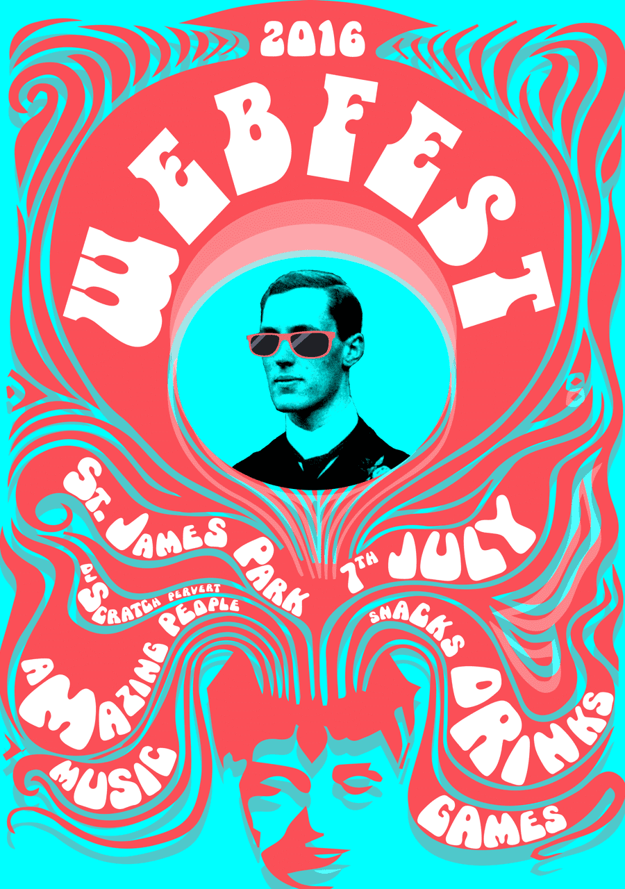
Poster designed by Faye
I woke up with my hair like this. True story.
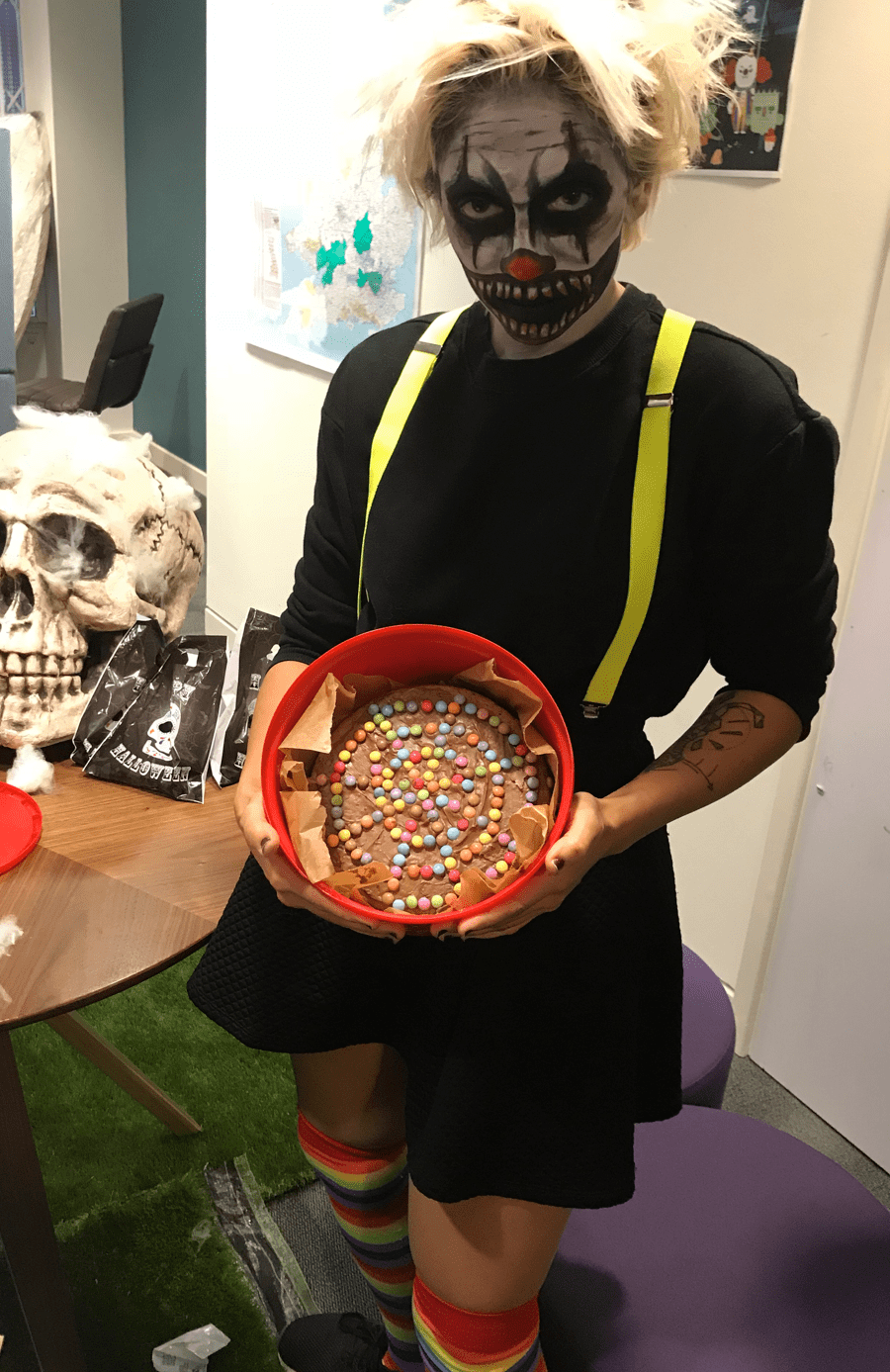
With plenty of spooky decorations, cakes, cookies and brains
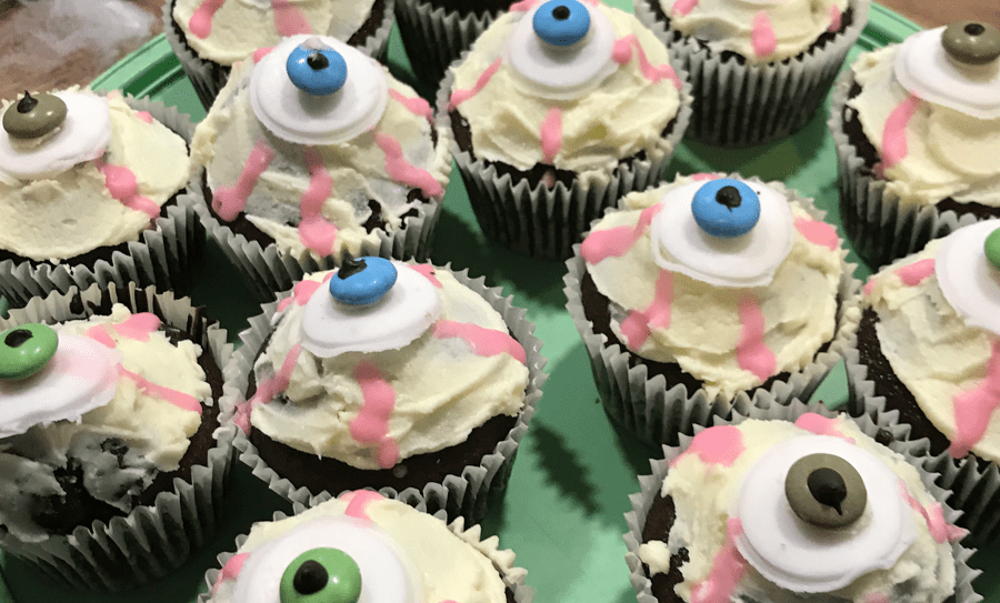
Some scary eyes, because we all need scary eyes
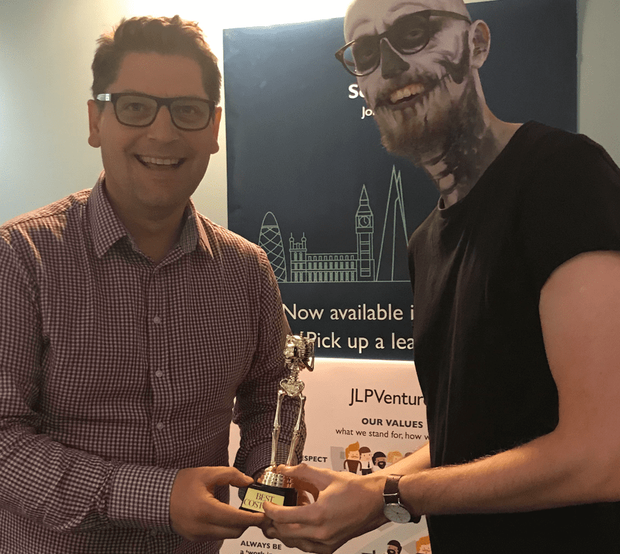
The best costume prize went to Stephen
We were even featured in the internal John Lewis and Partners magazine
 Back to main page
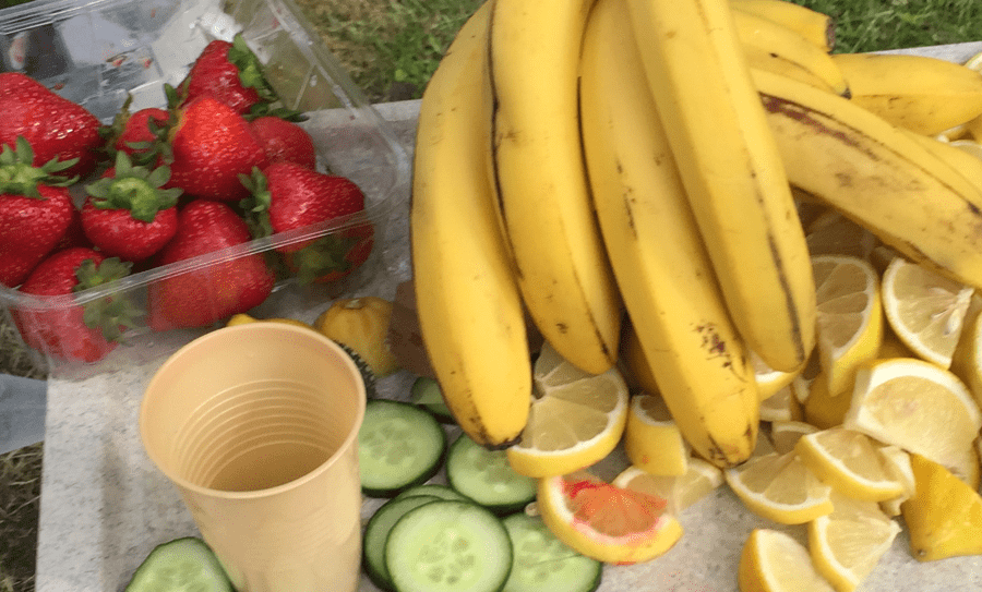
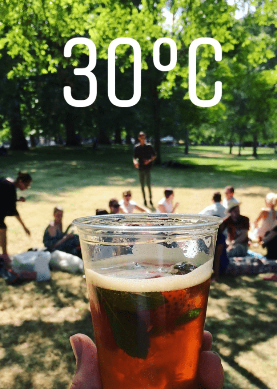
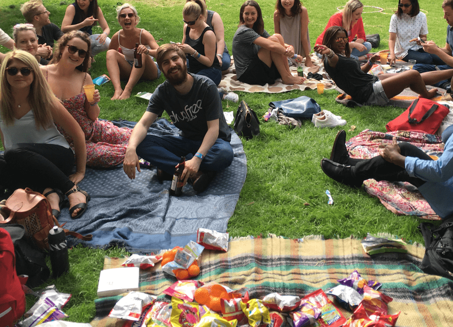
A summer festival on a budget arranged for a team of 55 in the park.
Poster designed by Margarida
Make shift Pimms stand
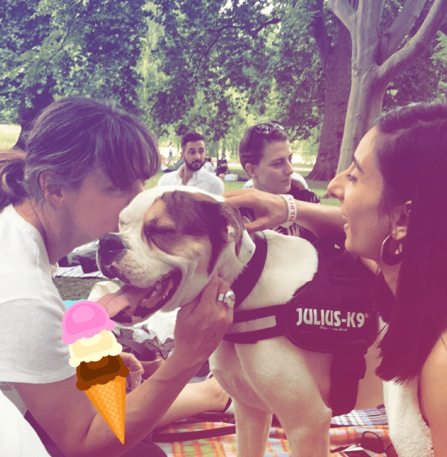
It's not a party without Winston
Plenty of snacks and drinks to keep all happy
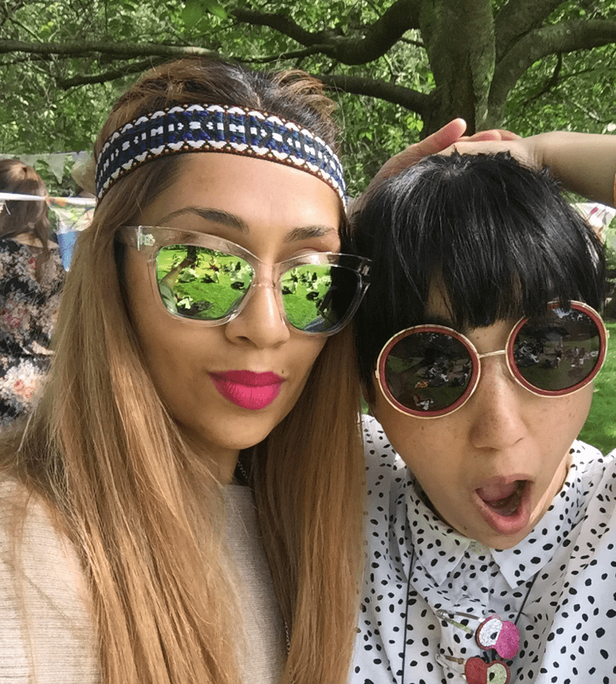
Margo the creative designer
 Back to main page
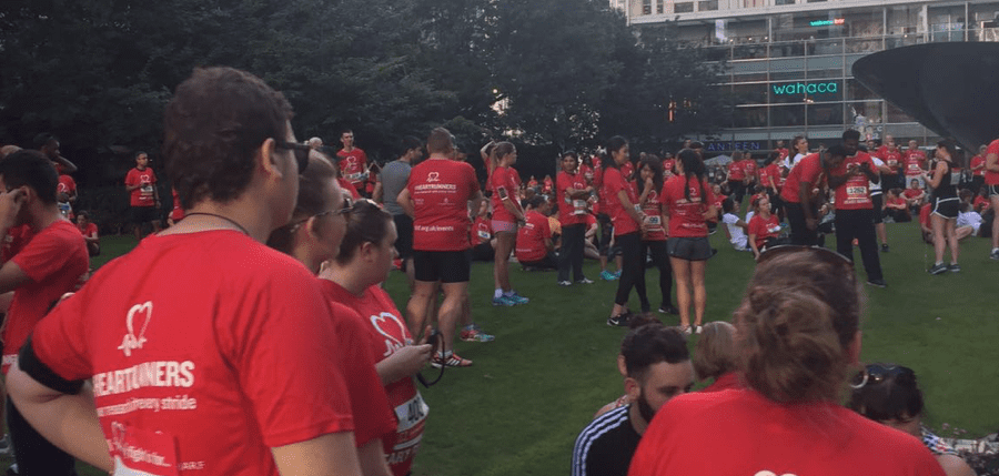
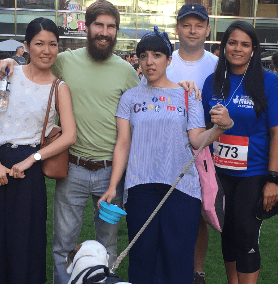
I like walking after work and often encourage work colleagues to join me. This time I thought we could go running, mainly for selfish reasons as I was training for a 1/2 marathon and absolutely hated running. Crazy, I know, however I got the support of colleagues who were more than willing to train with me.
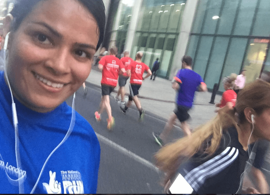
So many people had attended the charity run.
My colleagues (friends) had come along to run with me or to support us on the side line. Winston made an appearance to.
How is Bejal running and taking a selfie at the same time? Talent.
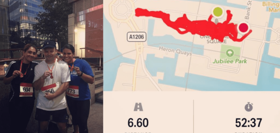
It was a hot evening, we were tired, there were so many people but we did it. Showing off our medals.
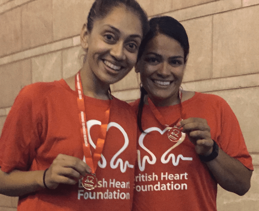
Grinning because we have Gin
 Back to main page
Work & Play
Ventures Halloween Party
John Lewis Web Fest
BHF Run